Quick-service restaurants (QSRs) are heading into 2026 hungry for growth, with revenue projected to hit...
Let’s be honest: “software implementation” doesn’t usually sound exciting. It brings to mind long project...
Customer experience (CX) is evolving fast—and the leaders defining its future aren’t just keeping up, they’re setting the pace. Across...
In the fast-paced world of software and tech, customer experience (CX) is what sets your...
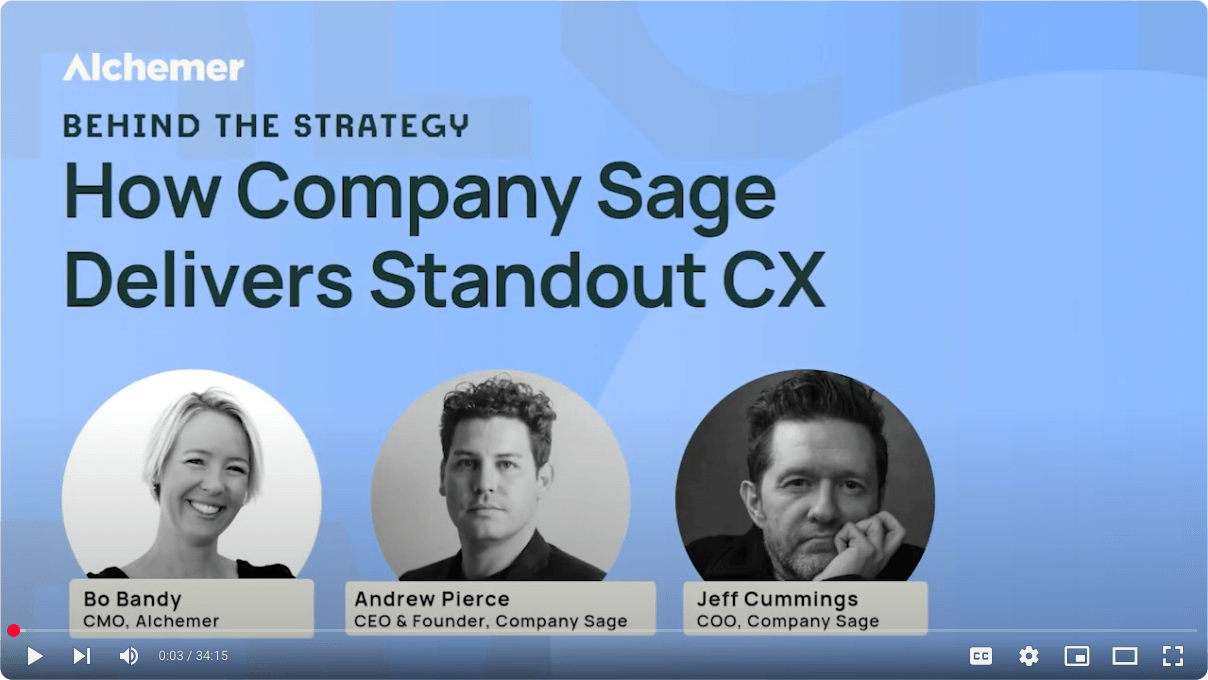
What does it really take to build a business around customer experience? In a recent...
The following blog references a recent Forrester report, titled “How To Measure Customer Experience Performance...
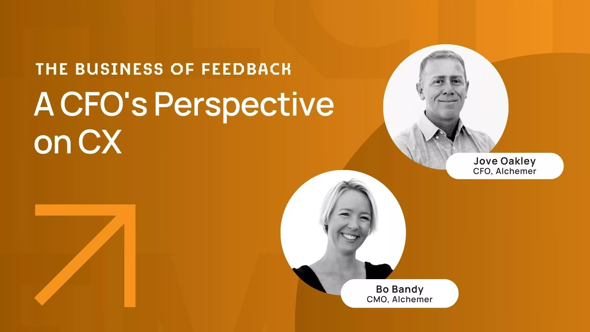
When CFOs push back on customer experience (CX) investments, it’s rarely because they don’t care—it’s...
As a CFO, you’re tasked with finding efficiency, reducing risk, and driving long-term value. Customer...
As organizations strive to improve and scale their CX programs, integrating feedback into business systems...
For businesses operating across multiple locations, customer feedback is a crucial asset in maintaining consistent...
With rising customer expectations and increasing competition, retailers must embrace new trends and innovations to...
Customer experience (CX) has never been more central to a business’s success. As digital channels...
Smart thinking: you’ve decided to use a survey to gather feedback on your company’s customer...
Introduction When did you first discover your passion for customer experience (CX)? Was it reading...
Forrester recently published a new best practice report, titled GenAI Is An Evolution — Not...
Imagine you’re delivering a crucial sales presentation. Suddenly, your potential client raises an objection. Instead...
“Customer service represents the heart of a brand in the hearts of its customers.” –...
“The aim of marketing is to know and understand the customer so well that the...
In today’s competitive landscape, customer experience (CX) stands as a cornerstone of success, particularly in...
The evolving world of customer experience (CX) brings new challenges, but at Alchemer we see...
By accessing and using this page, you agree to the Terms of Use . Your information will never be shared.