
Both pie charts and bar graphs are designed to help you communicate your survey results, but to convey your findings as clearly and accurately as possible you need to choose your graphs carefully.
Pie charts have recently come under fire from data visualization experts who argue that they are relevant only in the rarest of circumstances. Bar graphs, charts, and tables, they say, are far superior ways to quickly get a message across.
So when it comes time to present your survey results, consider the relative merits of each kind of graph before distributing your results. No matter how good your data is, the wrong medium can damage its credibility.
Pie Chart Basics
These types of visuals come across most clearly when you’re looking at six or fewer different categories, and they can be used for both nominal and ordinal data.
Nominal data falls into categories, like demographic information; ordinal data is similar but is also ranked. Responses that are on a scale, such as ranking an experience from “Very Poor” to “Very Good,” would be ordinal data.
For optimal readability, arrange the data wedges clockwise in order of magnitude. The exception to this guidelines is if you have a summary “other” category that includes several additional responses, which should go last in the clockwise sequence.
Additionally, it can help to shade slices from dark to light as you move clockwise around the pie to help make distinctions more clear.
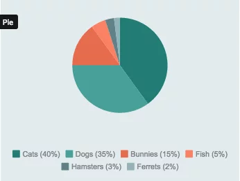
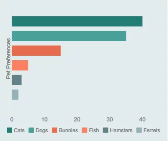
Here’s an example of responses to a question about pet preferences displayed as a pie chart:
Problems With Pie Charts
There are some very vocal opponents to the use of pie charts under any circumstances. Most cite what they see as pie charts’ failure to do their single job, accurately display data, with any consistency.
In an article on Business Insider called, Pie Charts are the Worst, Walter Hickey gives this example of how pie charts can fail to give meaningful insight into basic data:
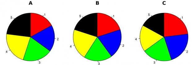
Hickey contrasts the above graphs, which are meant to show how various political candidates’ shares of the vote changed over time, with these bar graphs:
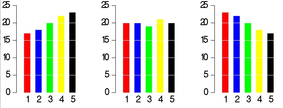
The bar graphs are using the same data set, but it’s much simpler to see the patterns here than in the pie charts.
Hickey calls pie charts, “easily the worst way to convey information ever developed in the history of data visualization,” which may be taking things a little too far, but this example makes it clear that they’re not always the right choice.
If you don’t have dramatic differences in your data percentages, it can be hard to see distribution on a pie chart.
Additionally, the popular 3-D versions can drastically distort data, making pieces that are widely different appear close to the same size. As a rule, steer clear of these types of pie charts no matter how flashy they may be.
Now let’s take a look at bar graphs in more detail so we can see how they stack up to their pie-shaped counterparts.
Bar Graph Basics
Like pie charts, bar graphs are appropriate for both nominal (demographic) and ordinal (ranked) data. They display data at relative sizes, except the visual is a bar rather than a pie slice.
For the best readability, you should arrange your bar categories sequentially from largest to smallest when using nominal data. However, in the case of ordinal data the categories should proceed in the proper order (e.g. Very Poor, Poor, Good, Very Good regardless of which was the most common answer).
If you’re using the standard vertical bar graph, the x-axis typically does not have a scale, as it simply represents the different categories of data.
The y-axis will have a scale, and each bar’s height should be proportionate to the size of the category it represents. This can create a problem if you have very disproportionate responses that impact the scale of your graph, so keep that in mind when formatting.
One thing that bar graphs do far better than their circular cousins is display negative data. Because bars can extend below the x-axis you can visualize negatives in a way that’s impossible on a pie chart.
3 Different Bar Graphs: Horizontal, Stacked, Grouped
Bar graphs have the additional advantage of coming in four different forms: the vertical version discussed above, horizontal, stacked, and grouped. Each one can be used in different applications to give you the clearest picture of your survey data.
Horizontal Bar Graphs
The graphs have a structure very similar to “regular” vertical bar graphs, except the bars extend horizontally along the x-axis instead of vertically on the y-axis.
In this case the x-axis would have the scale, while the y-axis would merely display the categories of your responses.
Horizontal bar graphs are the most useful when categories have long names that would be hard to fit below a vertical bar, or when you have lots of categories that might not fit well as horizontal columns across a page or screen.
Stacked Bar Graphs
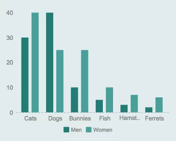
When you need to show how different sub-groups answer, stacked bar graphs may be the way to go. With these you can break down each category so you can see what proportion of the total responses each group represents.
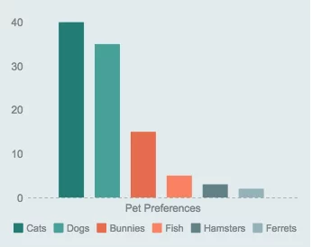
For example, if we surveyed people about pet preferences, we might want to have one bar that showed how many women preferred cats, dog, and bunnies, and a second bar showing how many men had the same preferences.
As you can see, these graphs have bars representing each group that are stacked on top of each other to form a single column (or side by side in a horizontal version). The overall size of the bar indicates the size of the total category, and the smaller bars (each of which is a different color) indicate the share each sub-group had in the total response
Grouped Bar Graphs
Grouped bar graphs work almost exactly like stacked ones, except in these charts the sub-categories each get their own bars.
Comparative sizes of sub-categories can be easier to see in these graphs, but their size can get out of hand quickly if you have more than a few categories to tackle. Don’t try to cram too much information into one grouped graph; split them up if the survey data becomes overwhelming.
When to Use Bar Graphs and Pie Charts in Surveys
The general rule of thumb here is that bar charts are the most commonly used types of graphs, and should be your go-to choice for most data visualization.
Bar graphs are very flexible since there are four different kinds, each of which can reveal different types of trends or relationships that you can’t show as easily with pie charts. Somehow pie charts became standard when tools like word processing and spreadsheet software started creating them for us, but there are few times when they tell a better story than a bar graph.
If you have ordinal or nominal data, put it in a bar chart first. If you still think the story of the data is unclear, you can always use the pie chart as your backup.
With that said, here are a few cases when pie charts work best:
- When you have only a few data points to display, and each one is substantially different in scale.
- To show that a few key data points represent the vast majority of the whole.
- To start a discussion about a general trend rather than convey precisely accurate data.
- To compare similar responses across different time periods, age groups, genders, etc.
With the right survey and visualization tools, your data can tell a story that’s easy to understand and act on.
👉 Turn survey data into clear, compelling insights with Alchemer: https://www.alchemer.com/dashboard/