Marketers and market researchers are often frustrated with the shallow impact of their survey results. Part of that has to do with how that data is presented.
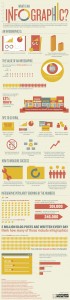
Using assets like infographics can help tell a story that others will want to share.
How Can an Infographic Help Convey Survey Data?
Not everyone is data driven. Because of that, not every single executive, manager, or critical decision maker is data driven, either. They may weigh other variables heavily – a gut feeling, anecdotal evidence, or emotional partiality. And that can be tough for those of us who are; those of us whose job comprises of the collection of vital data designed to help guide those critical decisions.
As advanced survey tools become more accessible to the casual researcher, individuals with a wider variety of experience levels and analytical skill will be delivering our key metrics. User-centric features like drag-and-drop data reporting tools (e.g. infographics) and the seamless exporting of reports and graphs into PowerPoint will make month-long research projects more like afternoon to-do’s.
It’s no longer enough to deliver accurate data, but the real value is in delivering usable data. If the data you collect isn’t being thoughtfully digested during it’s initial presentation, it likely won’t be reconsidered during the integral decision making meetings that follow. It’s more than probable that your audience members have to sell their ideas to a room full of oversight, and they won’t all be data-driven, analytical people either. So it stands to reason, the stories that propagate in those scenarios are the stories easiest to re-tell, and re-tell with enthusiasm. Infographics can help.
Designing an Infographic to Tell a Survey Story
So how do you get that vital data to stay front-of-mind? How does it evolve into data worth re-sharing enthusiastically? By telling a story. And how do you tell a great story? It all starts by knowing your audience.
Who are they, these stakeholders in your research? They may be CTOs, CIOs, Creative Directors, or Account Managers. Knowing their background, their technical expertise, and their investment in your efforts (what are they using it for?) should guide not only the data you highlight, but the manner in which you present it.
You wouldn’t give an astronomy lecture about the theoretical behavior of dark matter to a room of 11 year-olds. For the same reason, avoid discussing the Cramer-Rao Inequality when presenting your findings to a room devoid of statisticians. There’s an argument to be made that high-level directional findings, in many cases, are just as useful (if not more-so) than statistically significant, peer-reviewed research.
Find Multiple Perspectives
No great story has just a single character; a main character perhaps, but great stories always feature supporting characters to help the story along. The value of those characters is often perspective. Instead of adding multiple characters to your data’s story, consider the value of multiple perspectives – supplementary viewpoints from social media analytics, technology trends, current events and international developments, and internal changes within your company.
Focus on Design
You’ve got a few charts and tabular data, but that’s not going to cut it. What we’re looking for is aesthetically compelling visuals that by their very nature, want to be shared.
Consider these three important steps to creating high-quality data visualization:
1) Contextualize – make sure the visuals are accompanied by short-form text that concisely provides the audience with enough background information to understand the purpose of the research, the scope, and the demographic. Think of this as the grade-school lesson when you were taught to begin each story with the setting.
2) Provide the details – this is the meat of your presentation, complete with line items turned color-coordinated line charts. Consider consulting with a graphic designer to get the most out of what should be the eye-candy of your presentation.
3) Interpret the meaning – remember, what can be done verbally by you in a presentation can’t necessarily be repeated by someone else with the same result, so provide the conclusion of your research. Spell out the implications and make sure there is no second-guessing the interpretation of the data.
Provide the Complete Findings
While the abridged, visually compelling versions are the stories we’re trying to share, remember that your findings in full may be re-used by other teams of your organization. Data startups are minting money right now simply by providing features that discover new correlations amongst datasets not previously observed. Whatever you do, when you tell the story of your data, make sure you’re also making the raw data easily accessible.
There may be more to the story than you first thought.