
You have put a lot of thought, time, and effort into planning your event. But have you put much thought into your event registration form? You should. Did you know that at least a third of individuals will abandon the event registration process?
It would be a crying shame to have put so much effort into planning your event only to lose them at the time of event registration.
In this article, we will explore how you can optimize your event registration form to increase attendee registration.
Optimizing Your Event Registration Landing Page
I am going to assume that you have already created a customized landing page dedicated to your event. You have likely optimized it by:
- Developing compelling content that reflects your marketing message
- Clearly stating the value and benefits of the event
- Creating a clear call-to-action (CTA) that points them to the event registration form
- Using social proof such testimonials and videos from past events
- Adding social media links to your event registration page that include counters of how many others have shared your event serves as further social proof
Building a successful event registration form is just as important as optimizing your landing page.
Optimizing Your Event Registration Form
You need a good form design that keeps registrants moving towards the Submit button without much thought or effort.
Simple is best. People are leery of providing too much information. Keep in mind that there is an inverse relation between the number of items to be completed and abandonment rate.
Use these 7 optimization tips to increase your event registration rate:
Build Trust
A professional looking website with well designed pages, navigation, and web forms will build trust.
Avoid making choices for others. If you have an opt-in checkbox for any reason, leave it unchecked by default.
Encourage users to call if they have any questions. Creating personal dialogue will increase your submission rate.
Keep Your Form Short and Concise
Take a minimalist approach. Less is best when it comes to maximizing event registrations. Registrants will be turned off if you ask for too much information.
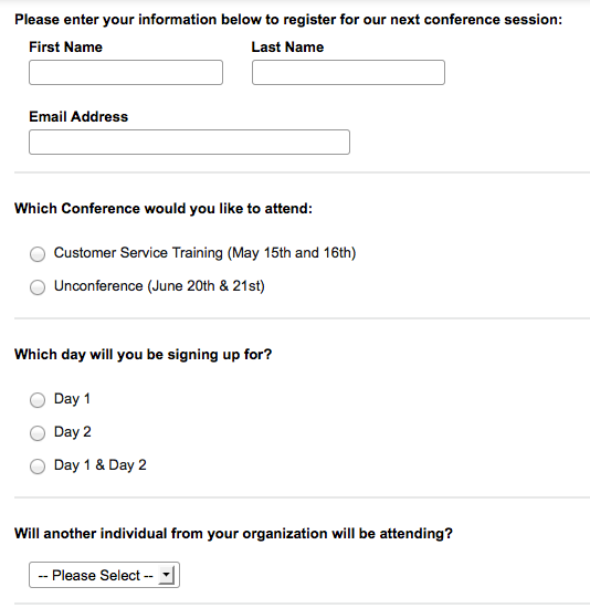
All you really need is their name and email address. Make these fields required.
If you are collecting payment at the time of event registration, you will need to ask questions that affect the payment amount. For instance, you may need ask how many in their group will attending and how many days they will attending. These fields should also be required since payment amount is dependent on them.
If you use multi-level questions, use conditional logic to so only relevant questions are triggered (e.g., a “Yes” to “Will you be attending more than 1 day?” triggers a second question about accommodation choices).
If your registrants need accommodation for your 3-day event, you will want to ask them if they need lodging. However, if you are not collecting payment for the lodging at the time of event registration, you can ask this question in a pre-event survey.
Other fields such as phone number, company name and job title are nice to haves but should not be required. Avoid asking for other firmographic information. You can get this information later.
Here is a an example:
Optimize Field Labels
The labels you use for the fields on your online event registration form can have a big impact on how easy it is for registrants to complete your form.
This is not the place to show off your creativity. Traditional labels work best. People don’t read registrations forms; they skim them. Don’t frustrate your users by making them stop to read.
Take into consideration the following items when optimizing your field labels:
Minimize Text
If you have to repeat an instruction, group the questions together and put the instruction once above the first group.
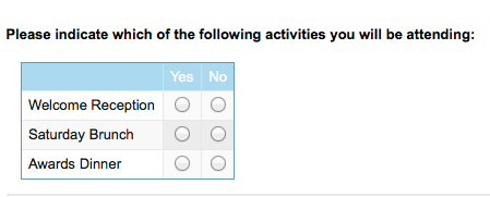
Another option is to group similar questions together in a table rather than as separate questions as in the example below.
Field Width
When you have a series of text boxes in a column, making them a consistent size is easier on the eye.
Field Alignment
Depending on how many fields you have and their length, you may want to consider a 2 column alignment to keep the form shorter in appearance.
Label Position
Placing the fields labels on the top of the entry box is much easier to use. Watch for word wraps and if necessary reword so that the labels fit nicely.
Font Style
Are all of your fields bold? There is a natural tendency to overuse bold. If you bold everything, the effect is diminished. Is the font so large that scrolling is required? Is the font type easy to read. Script or italic may look nice but is harder to read. Keep it simple.
White Space
Make sure that you have a reasonable and consistent amount of margin between the edge of your form and the text and fields on the form. Seeing text or fields touching the edge of a form is a sure sign of a rush job.
Another critical place for white space is around the submit button to make sure that it really stands out.
Optimize Images
Use quality image and make sure they are sized appropriately. This includes logos.
Optimize Call to Action
Make your Submit button stand out. A splash of color will draw the eye towards it. Orange is a favorite. According to Wikipedia, Orange represents energy, enthusiasm, and a ‘get-it-done’ attitude. Green is another favorite color. It implies ‘go now’. Consider your website colors and what looks appealing on your site.
Test the size of the button. You don’t want to make it so large that it is screaming at your user but you certainly want it to call attention.
Also test the message on your registration button. “RSVP Now” or “Submit RSVP” may produce better results then “Submit”.
Optimize For Mobile
If your audience is on the go, your registration form should be too.
Most online registration and survey tools have the technology to detect the type of device being used and display the theme that is sized for that device. Usually this is just a matter of setting up a default theme for the different devices. Taking advantage of this feature will avoid frustration on the user-end!
Remove Reset Button
Back in the day (early internet) it was not uncommon to have a reset button for online registrations. This button would clear all fields. If you still have this on your registration page, please remove it!
Nothing is more frustrating for a user who just completed your required fields than to have to re-enter the information when they really only meant to clear one field. This is a sure way to lose a registration!
Follow Up With a Pre-event Survey
Here is the truth – everyone hates filling out forms. But your event is worth it and these optimization tips will help increase your online registration rate.
Once you have committed attendees, use a pre-event survey to collect the details you need, so you know how to best accommodate them.
A post-event survey is another great opportunity to collect feedback for your event, and collect more customer data. But that is another story….
Discussion:
How have you optimized your online registration form? Did it increase your submission rate? Share your story here!