
Would you like to find a way to more than double your customer lifetime value? Simply boost customer satisfaction a bit, and watch the magic happen. Research shows that a customer who rates themselves as “totally satisfied” will contribute 2.6 times as much revenue as one that rates themself as just “Somewhat Satisfied.”
Before you can start increasing customer satisfaction you’ve got to measure it first. The three most powerful tools are the Customer Satisfaction Score (CSAT), Net Promoter Score (NPS)®, and the Software Usability Scale (SUS). Each metric offers unique insights and benefits.
In this article we’ll take a look at all three and offer insights into when each metric can make the biggest impact.
Customer Satisfaction Metrics: NPS® and CSAT
Since its introduction in 2003, the battle between the Customer Satisfaction Score (CSAT) and the Net Promoter Score® (NPS) has been in full swing.
CSAT measures customer satisfaction with various aspects of their experience with a product or service, while NPS® gauges how likely they are to recommend your product or service to others.
Proponents of NPS® claim that it’s a more accurate indicator of customer loyalty and long term growth, while its detractors argue that its single question format is not ideal, nor is it a good indictor of whether someone would actually recommend something.
Of course, there’s no rule that says you have to take sides in this debate. Let’s take a closer look at CSAT and NPS® and in which situations their strengths really shine.
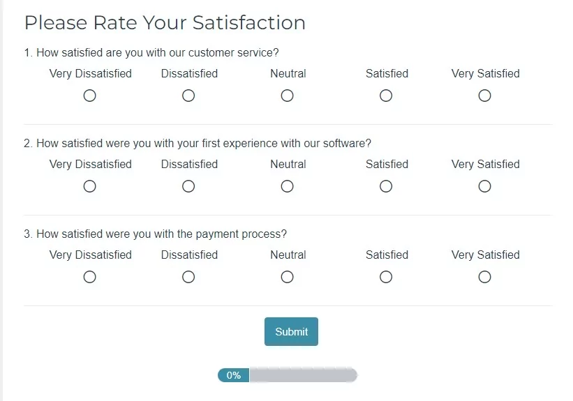
CSAT: Definition and Example Questions
A CSAT survey is a tool that businesses use to understand how happy their customers are with their products, services, branding or support. Companies commonly use these surveys to measure customer satisfaction, especially during onboarding and after a purchase.
CSAT surveys target specific components of the customer experience. Here are some sample questions:
By administering these questions at different stages of the customer journey, you can track satisfaction over time and identify areas for improvement.
This data can be highly actionable, but it can also be biased. In a very insightful article, Zendesk argues:
While viewing customer satisfaction this way is useful, there’s still one problem. Even though you’re looking at satisfaction over time, you’re missing a piece of the puzzle because this view gives extra weight to your most vocal customers…and to your most active customers, who keep coming back and are likely to be fairly happy.
To counteract this potential bias, add NPS into the mix.
What is a Good CSAT Score?
CSAT scores can differ by industry, but generally, a good score is between 75% and 85%. Since CSAT focuses solely on positive feedback, achieving a near-perfect score is tough. A 75% score means that three out of four customers rated their experience positively, rather than negatively or neutrally.
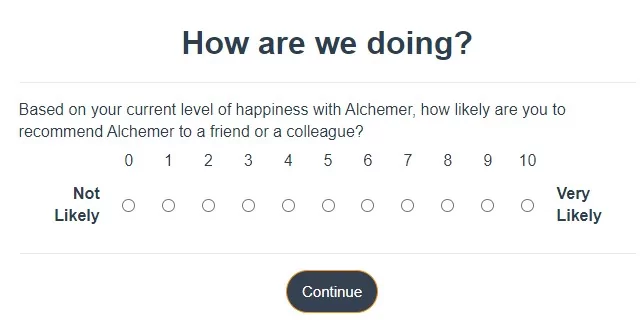
The NPS® Question: Definition and Example Questions
NPS® surveys consist of a single question: How likely are you to recommend SOMETHING to a friend or colleague?
To get from these numbers to the actual NPS® score you simply take your total percentage of Promoters and subtract the percentage of Detractors. You can leave it as a percentage (43%) or change it to a whole number (43), depending on what seems to make the most sense for you.
For more actionable data, we suggest following up this scale question with an open text field that allows respondents to give you qualitative feedback.
Analyzing open ended survey questions (also known as open text analysis) can be time-consuming, but you’re going to learn far more about the reasoning behind your NPS® score. If you’d like to speed this process up, check out Alchemer Pulse, our product for uncovering hidden customer insights through AI. Whether positive or negative, there is always something to learn from asking for additional input.
What is a Good NPS® Score?
According to Bain & Company, who created the NPS metric, an NPS score above 0 is a good start, above 20 is great, and above 50 is fantastic. Scores over 80 put you in the top tier. However, keep in mind that what makes a good NPS score can depend on whether you’re using the absolute or relative NPS method.
Choosing Between CSAT and NPS®
If you have the ability to measure both satisfaction and likelihood to promote, using both metrics is preferable.
CSAT is great for tracking satisfaction with specific features, while NPS is better for understanding overall customer loyalty and word-of-mouth potential. If you must choose one, consider your goals and the type of action you’re prepared to take. CSAT is better for short-term insights, while NPS is more of a long-term measure.
Measuring a Product’s Usability with SUS
The System Usability Scale (SUS) is a 10-item questionnaire designed to measure people’s perceptions of usability. It provides a quick and reliable way to measure how easy your software is to use.
Unlike NPS® and CSAT, this set of questions focuses solely on how your users feel about their experience using the product. For this reason, it’s often used with one of the other satisfaction scales rather than as the sole CSAT metric.
Although originally created ton some of the first software applications, it’s now commonly used for all sorts of products, including hardware, websites, cell phones, and other physical products. SUS is ideal for customer experience teams looking for a simple yet effective tool.
Who Should Use the SUS Scale
The System Usability Scale (SUS) is beneficial for any team dealing with a computerized system. It’s cost-effective, quick to implement, and yields valuable insights even with small sample sizes. SUS scores help you track overall usability but won’t pinpoint specific issues.
SUS scores, however, are not diagnostic tools. They won’t necessarily tell you which particular aspects of your system are difficult for users to navigate. Instead, they’re designed to help measure and track the overall ease of use for a piece of software.
SUS is also very quick and inexpensive to implement, making it ideal for customer-focused teams that don’t have large budgets.
Finally, if you have a small sample size (i.e. not a lot of customers), SUS is a great choice. Even with a small data set, its results have consistently proven valid and useful.
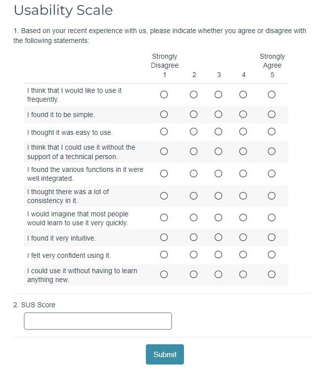
SUS Questions: 5-Point Scale
Although only ten questions long, the SUS survey uses simple scale questions that are quick and easy for respondents to follow:
- I think that I would like to use this system frequently.
- I found the system unnecessarily complex.
- I thought the system was easy to use.
- I think that I would need the support of a technical person to be able to use this system.
- I found the various functions in this system were well integrated.
- I thought there was too much inconsistency in this system.
- I would imagine that most people would learn to use this system very quickly.
- I found the system very cumbersome to use.
- I felt very confident using the system.
- I needed to learn a lot of things before I could get going with this system.
Each of these questions asks users to rate their agreement from “Strongly Disagree” to “Strongly Agree”:
Scoring and Interpreting SUS Responses
It can be challenging to accurately turn responses to the above ten questions into an accurate SUS score, but once you’ve got the process down you’ll be able to plug a new response into the formula easily.
It works like this:
- Each question receives a score between 1 and 5, based on a respondent’s level of agreement.
- For the odd numbered questions, which are all positive statements, subtract 1 from the score.
- Even numbered questions are negative statements. Subtract their value from 5.
- Take all these adjusted results and add them together.
- Multiply this total by 2.5.
These calculations will give you your score on a scale of 0-100, but it’s not a percentage result.
Think of it more like an academic grade. The average result is 68, so if you’re at or above this you’re on the right track.
Correlations Between Usability and Customer Satisfaction
Just as CSAT and NPS® can give insight into different parts of the customer’s life cycle, combining SUS and NPS® can do a lot to fill in gaps in your data.
Jeff Sauro (and many others) have found a very strong positive correlation between Net Promoter Score and SUS results (.61 to be exact). This means that SUS scores can explain about 36% of the variability in NPS results. A SUS score of at least 88 is typically needed to achieve a Promoter score.
As with any survey question, you need to understand the outcomes you’re hoping for, then choose the metric (or metrics) that will get you the most actionable data with stretching your internal resources too thin or fatiguing your customer bases through over surveying.
If you’d like to learn more about how Alchemer can support your customer feedback programs request a demo!