
Are your web forms accessible? They should be – everyone benefits from a well-designed form. Failing to make your event registration form, newsletter signup, contact form, job application, or appointment request form accessible to everyone means a lost opportunity for both you and your visitor.
Accessibility means that everyone, including those with disabilities can access and navigate your web form or online survey. Users who are blind, visually or physically impaired, need to be able to determine the purpose of a specific form element and interact with it without the aid of a mouse.
Making your online forms more accessible is not as difficult as it might seem. It simply requires adding some useful tags in the markup and being careful about form layout.
If you are using an advanced online survey tool or form builder that is compliant with Section 508 of the Americans With Disability Act, it will automatically take care of this markup for you.
Good Form Design
The most important factor to consider when designing your form is usability. It is important to make sure your web forms are easy to understand and intuitive to use.
When it comes to navigating your form and labeling your fields, simple is best.
Keep it clean so users understand what information they need to complete. If your web form is long and complex, you will lose users along the way.
Imagine using a screen reader and you come to web page that is loaded with images and quirky messages. You need to cut through all of the noise and distractions to find the input fields. Are you that patient?
Keep your goal in mind; get your users to submit your form with the correct information!
Form Layout
A good form design is one that flows logically.
People tend to interact with forms in a consistent manner. Human-Computer-Interaction (HCI) models have been developed based on these consistent patterns. Adaptive technologies such as a screen and braille readers use these principles to interpret web pages and forms.
Laying out your forms according to HCI principles, will make your forms more accessible and easier to use. Not following expected practices will result in problems such as zip codes in your state field and an increase in abandonment.
So let’s discuss these principles as they relate to web forms.
Form Labels
Improve the layout of your online forms by placing form labels near the associated input field.
Exactly where you place the label varies depending on the format of the input field. The label for textbox fields is different than that of checkboxes or radios buttons.
Text Fields
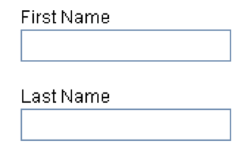
For text fields, the text should precede the input field, either directly above or to the left. The inputs should be presented to the user like this:
Or, with the text field label positioned to the left:
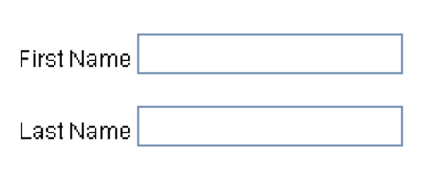
As screen readers encounter a text input, they expect that the text related to it comes before that input. If a label is displayed after the text input as in the example below, it has difficulty and assumes the next input field is the correct point of entry.
![]()
In the example above screen readers would interpret the first name label for the last name input field.
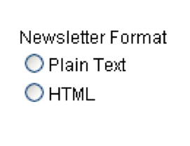
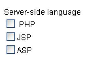
Radio Buttons and Checkboxes
Labels for radio buttons and checkboxes is the exact opposite from textboxes. The label is displayed to the right of the input
This allows for a neat layout with a nice alignment as in the examples below.
Radio Buttons:
Checkboxes:
Group Together Related Fields
Use a logical order for reading and navigating the form. Like fields should be grouped together.
For instance billing information should be grouped together and may be different than shipping information.
Don’t deviate from standard formatting order. People are used to entering their street address before city, state and zip code. Because they expect fields to appear in this order, they tend to skim rather than read the label. You can expect problems if you stray from the norm.
Keyboard Accessibility
One of the top requirements for accessibility is the ability to navigate a form with only the use of a keyboard. This is crucial since a visually impaired user or someone who is lacking fine motor skills, will not be able to use a mouse. Assistive technologies such as screen readers and voice-input systems solely depend upon keyboard navigation.
Activating Drop Down Navigation Menus
Be careful when using JavaScript with drop down navigation menus. Your users may not have the option of using a mouse to scroll through the list. When using a keyboard, the first item in the drop-down-menu can unintentionally be activated when users attempt to tab through the list options.
If you are going to use a drop-down-list for navigation, provide a mechanism that allows the user to activate the selection. The example below uses a Go button, to achieve this:
![]()
Difficulties With Tables
Tables can give your online form or survey a nice grid layout but use them with caution. If the label and the form element are separated it becomes hard for screen readers to interpret the field.
Screen readers decipher the table content in the order it appears in the source code. If the text and the form element that the text relates to are split, you will cause readability issues.
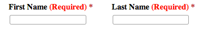
Provide Instructions and Visual Cues
If some of your fields are required (like name and email address), provide a cue or instruction that the field is required.
Simply making the font red or putting an asterisk next to it will not suffice for those who are visually impaired. By stating that the field is required, screen readers will alert the user.
Below is a good example of how to do this:
Advanced form builders or survey tools that are 508 compliant automatically place the required attribute in the label element when you specify that an answer is required before the form can be submitted. Still, it is good practice to provide a cue so that those who are visually or physically impaired but are not using an assisted device may also be alerted.
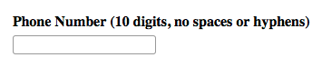
Also provide instruction if you have fields that need to be entered in a certain format. For instance if you are collecting the users phone number and do not want any spaces or hyphens, state this. Below is an example:
Problems With Interactive Question Types
While it is tempting to use some of the more interactive questions types that advanced online survey tools and form builders have, these are not keyboard accessible. These include image choice, ranking, and drag and drop question types.
There is certainly a good place for these question types, but your web form is not one of them.
Use Alternative Text for Images
If you are using images in your form or survey, you will need to add alternative text when you upload your image so that screen readers can present users with a text description in place of the image that they cannot see.
Button Messages
Be sure to include text on your buttons that indicates the purpose of the button. When the focus is placed on the button, screen readers will read this text. If you do not include text on your button, your users will be confused about its intent regardless if they are blind or sighted!
Click Here Links
Links that say “click here” are ambiguous for all users, let alone those who are using screen readers. Use descriptive text for your links.
If your link takes them to a feature or pricing page use this content in your text link.
Form Validation
Form validation ensures that the user provided necessary and properly formatted information need for a successful completion.
Some sites use client-side scripting for validation. By using JavaScript, users’ input can be validated as they type. This means a more responsive, visually rich validation.
The problem with client-side validation is that some some assistive devices do not support JavaScript.
Your form should be usable regardless of whether scripting is enabled or not. Server-side scripting solves this problem by validating the fields after the form has been submitted. Errors are then presented to the user for correction. While this method is not as fast, it is reliable.
Advanced survey and web form tools utilize both client-side and server-side scripting so that validation and error correction can be provided in a usable and accessible manner.
User-Accessible Forms
All users should be able to interact with your site. What many businesses fail to recognize is that they are losing an opportunity when they limit the ability for users interact with their product or service by not making their forms accessible.
To make your web forms more accessible remember to:
- Keep your form simple and remove any unnecessary details and distractions that keep them from completing the form
- Build forms that are easy to use and intuitive
- Place form labels near the associated input field. Labels for text fields are placed above or to the right of the input field. Radio button and checkbox labels go to the right of the input field
- Group related fields together
- Ensure the forms are keyboard accessible and do not rely on JavaScript
- Provide all necessary instructions, cues, and prompts
Test your site! The WAVE web accessibility evaluation tool is an easy-to-use tool that gives you feedback about the accessibility of your web page.
Discussion:
Many businesses believe that they don’t need to comply with Section 508 since they are not a government agency. But if you are a contractor or consultant working with a government agency your forms need to be 508 compliant.
How about you? Have you made your web forms user accessible?
Sources: