- Resource Library
- E-guides
- Question and Explore: Find the “Why” Behind Your CX Metrics
Guide 3: Question and Explore — Find the “Why” Behind Your CX Metrics
Use AI-powered dashboards to answer complex questions and uncover insights you can act on fast.

Intro
You’ve collected your data, set benchmarks, and identified the metrics that matter. But metrics alone don’t explain what’s happening—or what to do next. To drive real change, you need to explore your data, ask sharper questions, and uncover the “why” behind your results.
In this guide, you’ll follow three real-world scenarios—from a CX insights leader, a product marketing manager, and a support operations manager—as they use AI-powered analytics to dig deeper, find patterns, and turn insights into action.
From Static Dashboards to Smart Exploration
Before we jump into the stories, let’s set the stage.
Dashboards pull your most important metrics and KPIs into one place so you can spot trends, track performance, and make data-backed decisions. But traditional dashboards often stop at reporting: they show you what happened, then leave you to figure out why.
That “why” usually takes extra effort because traditional dashboards tend to be:
- Manual to maintain: Data collection and updates can be scheduled and hands-on, which introduces delays.
- Less automated: Charts and views often require analyst support to build and refresh.
- Limited for exploration: Users are stuck with predefined views and can’t easily drill down, segment, or pivot in the moment.
AI-powered dashboards change the workflow. Instead of chasing reports or wrangling spreadsheets, you can explore in real time—filter by region, channel, customer type, or time period—and even ask questions in plain language to surface patterns and root causes faster.
That’s where Alchemer Dashboard and Spark come in: they help turn continuous feedback into continuous insight, so you can move from metric → explanation → action without the lag.
Now, let’s see what that looks like in practice with three real-world use cases.
Alchemer Dashboard: Turn Feedback Into Results
Alchemer Dashboard delivers real-time, AI-powered insights that drive smarter decisions. Get a complete and actionable view of what’s working (and what’s not):
- A Complete View = Action: Easily build and customize your dashboards, connecting feedback with business data for a 360° view of what’s working—and what’s not—so you can act decisively.
- Turn Feedback into Business Impact: Transform feedback into dynamic, real-time insights that drive measurable outcomes. Don’t rely on static reports – instead, uncover actionable intelligence.
- AI-Powered Insights, Instantly: As easy as typing a question—and boom—gain deep analytical insight, without the hassle of complex BI tools. Powerful, AI-driven insights that empower everyone to explore data, uncover trends, and act right away.
Real-World Use Cases
In the following scenarios, three teams use Alchemer Dashboard and Spark to move beyond surface-level metrics and uncover the insights that actually drive change.
Each starts with a signal. Each asks better questions. And each insight drives action.
Improve customer satisfaction
Use Case 1: Improving Customer Satisfaction (CSAT)
Scenario
Pat leads customer insights at a global retail brand. Every month, she reviews customer satisfaction scores across regions and channels. Most months, the trends are predictable. This month isn’t.
CSAT has dropped sharply—its first decline in six months. The numbers aren’t catastrophic, but they’re enough to raise concern. Executives want to know what happened, frontline teams want direction, and Pat knows that if the issue isn’t identified quickly, it could escalate into lost customers.
Solution
Before diving in, Pat reflects on recent changes across the business. One stands out: a major website redesign rolled out earlier in the quarter. While the goal was to improve the user experience, Pat suspects it may have introduced new friction.
She starts by framing a few key questions in the dashboard:
- What caused the CSAT dip in March?
- How does CSAT vary by channel and region?
- Did the website redesign impact customer satisfaction?
- Are certain product categories or teams driving dissatisfaction?
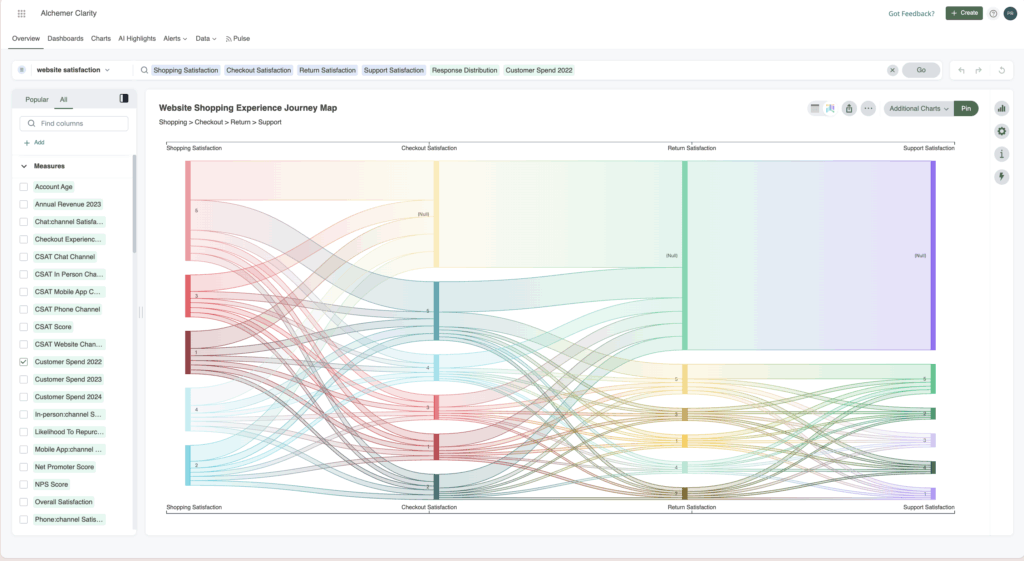
Pat builds a comprehensive dashboard pulling in survey responses, channel data, and regional breakdowns. Instead of just showing numbers, the dashboard begins to tell a story.
Ask, Drill, Uncover
Monthly CSAT Trends
The dashboard reveals a clear decline: CSAT dropped from 85.94 in February to 74.64 in March—a decrease of over 13%. The timing confirms the urgency to act.
Channel-Specific CSAT
When Pat compares CSAT across the website, mobile app, and customer service channels, one channel stands out. Website satisfaction is significantly lower than the others, suggesting the redesign may be contributing to the decline.
Geographical CSAT Insights
Filtering by country, Pat sees that the drop isn’t global. Canada shows a much sharper decline than other regions.
To explore further, Pat turns to Spark and asks:
“How does CSAT compare by country?”
Spark visualizes the comparison instantly, reinforcing that Canada is the biggest outlier.
Pat drills deeper:
“Show CSAT by week in Canada.”
The decline starts the same week the website update launched in that market.
Next, she asks:
“Show this by age range.”
This new view reveals that customers aged 55+ are struggling the most. When Pat overlays open-ended survey comments, common themes emerge: difficulty finding products, slow page load times, and confusion accessing accounts.
Insights
Here’s what Pat uncovered:
Website navigation issues were confirmed as a primary driver of dissatisfaction.
- Geographic segmentation showed that Canada was most negatively impacted by the website update.
- Demographic drill-downs revealed that older users (55+) struggled the most with finding their accounts on the website post-redesign.
- When Pat filtered for in-store channels, she saw a clear pattern: online reviews pointed to low customer satisfaction driven by negative staff interactions.
But that’s not the end of the story. Finding the key insights is only the beginning, read “Make a Change: Turn CX Insights Into Real Improvements” to learn how Pat acted on her findings and implemented improvements.
Spark: Your AI-Powered Dashboard Experience
Alchemer Dashboard’s AI features help you move past static charts to the insights that matter. Instead of hunting for patterns manually, AI surfaces trends, explains what changed, and identifies root causes—so teams of any skill level can get to answers faster.
Improve customer satisfaction
Use Case 2: Improving Customer Satisfaction (CSAT)
Scenario
Tom, the Director of Customer Experience at a technology company, starts his day with an alert from his dashboard: “Churn risk score trending upward.”
This isn’t a one-off anomaly—it’s the third month in a row showing increased churn risk. Tom knows that unchecked churn compounds quickly and can lead to serious revenue loss.
Customer loyalty doesn’t hinge on a single interaction. It’s shaped by every login, support ticket, survey response, and moment of value (or frustration). To understand what’s happening, Tom turns to his Customer Loyalty Dashboard.
Solution
Tom’s dashboard does more than count churned customers—it predicts them.
By consolidating usage patterns, customer feedback, survey responses, and engagement metrics, Tom builds a single view of customer health. With that, he can identify at-risk groups, investigate why they’re churning, and take action before more customers follow suit.
Here’s what the dashboard reveals:
1. Churn risk score over time
A calculated score based on NPS, CSAT, spend, purchase frequency, and product usage. Tom spots a sharp spike tied to customers with low usage and infrequent purchases—especially those in the “Gold” membership tier.
2. Loyalty metrics at a glance
- NPS trends, segmented by promoters, passives, and detractors
- Usage frequency, with alerts triggered when usage dropped below thresholds
- Likelihood to repurchase, based on recent behaviors
- CSAT by state, flagging geographic pockets of dissatisfaction
- Last purchase date, pinpointing when engagement began to decline
- Feedback channels, showing where customers shared concerns most often
3. Membership level segmentation
Surprisingly, some of the highest churn was happening among long-standing Gold members. Digging deeper, Tom discovers that usage frequency has dropped to once per year. These customers don’t feel valued, and they don’t see a reason to stay.
Ask, Drill, Uncover
To get ahead of churn, Tom relies on Spark, the dashboard’s AI-powered assistant, to explore complex relationships in the data.
“Do churned customers report more product issues?”
Spark confirms a trend: churned users are three times more likely to leave negative feedback about onboarding and setup.
Digging deeper, Tom explores:
- Is churn higher among users who skipped onboarding?
- Are churned customers disproportionately facing specific product or service issues?
- Is there a correlation between feature usage and retention?
- Did pricing changes align with churn spikes?
- Are loyalty members churning less?
With Spark, Tom digs into exit survey comments, compares retention by feature usage, and analyzes repurchase likelihood based on membership level.
Insights
Tom uncovers several critical patterns:
- Underutilized features are a common trait among churned users.
- Onboarding gaps strongly correlate with churn risk.
- Loyalty status alone isn’t enough—many long-tenured customers are disengaged.
- Usage frequency is a stronger predictor of retention than tenure.
Read “Make a Change: Turn CX Insights Into Real Improvements“ to see how Tom turned these insights into targeted onboarding improvements, proactive engagement strategies, and a measurable reduction in churn.
Improve support satisfaction
Use Case 3: Improving Support Satisfaction
Scenario
David, the Manager of Customer Support at healthcare company finds himself in a familiar situation: support tickets flood in from every direction, email, chat, phone, and the mobile app. Each channel has its own workflow, its own metrics, and its own feedback loop. While customer satisfaction surveys go out after every interaction, the insights are scattered and inconsistent.
The result? A growing sense that something is slipping through the cracks. Response times creep up. Agent productivity feels uneven. And worst of all, David has no easy way to see which channels delight customers—and which disappoint them.
Solution: A unified view of support feedback
That’s when David builds a centralized Support Performance Dashboard using Alchemer.
By pulling in post-interaction CSAT and NPS data from all support channels, the Dashboard becomes a single source of truth. For the first time, David’s team has clear visibility into how customers actually feel across chat, email, phone, and more.
Here’s what the dashboard delivers:
1. Channel-by-channel breakdown of CSAT and NPS
Each support channel scores individually, so David can quickly spot trends. For instance, while phone and email CSAT remain steady, chat support shows a noticeable dip during a two-week stretch in Q1.
2. Time-based analysis
David overlays CSAT scores over time to detect seasonal dips and surges. He notices post-holiday spikes in volume coincide with lower satisfaction, likely due to slower response times and overwhelmed agents.
3. Team performance metrics
Customer satisfaction isn’t just tied to the channel, it also varies by team ratings. In chat, promptness scores drop, perfectly aligning with the CSAT decline. Courtesy and expertise remain high, but slow replies are costing them satisfaction points.
4. Segmentation by customer type
David filters by usage frequency and sees that new users trigger a higher volume of surveys—and often leave lower ratings. The insight? First impressions count, and onboarding support needs attention.
Ask, Drill, Uncover
Before the dashboard, David’s team was drowning in data. With it, they can finally ask the right questions—and get answers fast.
With Spark, the built-in AI assistant, David explores:
- Which channels have the lowest CSAT or NPS?
- How do agent response times correlate with satisfaction?
- Are there seasonal trends in CSAT scores we should plan around?
- Are new users less satisfied than long-term customers?
- What support traits (promptness, courtesy, expertise) impact CSAT the most?
Spark allows him to query real-time data and visualize answers immediately—no spreadsheet wrangling required.
Insights
David uncovers a consistent pattern:
- Chat CSAT dropped by 15% during peak periods.
- Promptness—not courtesy or expertise—is the strongest driver of dissatisfaction.
- New users are most sensitive to response delays.
- Seasonal volume spikes repeatedly align with lower satisfaction scores.
Read “Make a Change: Turn CX Insights Into Real Improvements“ to learn how David used these insights to optimize staffing, improve response times, and deliver a more consistent support experience across every channel.
Conclusion
Customer feedback isn’t just a post-interaction formality, it’s your roadmap to better experiences, stronger relationships, and smarter decisions. Whether you’re trying to boost satisfaction, reduce churn, or fine-tune your support strategy, the key lies in turning scattered data into meaningful insights.
With Alchemer Dashboards and Spark AI, Pat , Tom, and David aren’t just reacting to problems, they’re anticipating them, solving them faster, and making every customer interaction count. From high-level trends to deep-dive diagnostics, the tools are built to help you see the full picture and act with confidence.
Because when you truly listen, and you truly understand, you don’t just improve metrics. You improve the moments that matter. And that’s what drives loyalty, retention, and growth.
Curious to see how these use cases turned insight into impact? Check out “Make a Change: Turn CX Insights Into Real Improvements” !
Interested in seeing how Dashboard can transform your feedback?
The Roadmap to a Great Dashboard!
This e-guide is just one part of a multi-guide series and story. Use the links below to checkout the other guides!
Step 1: Setting the Foundation for an Effective Dashboard
Step 2: Measure & Benchmark for Smarter Business Decisions
Step 4: Make a Change: Turn CX Insights Into Real Improvements
Step 5: Using Dashboards to Drive Change
Follow three real-world scenarios—from a CX insights leader, a product marketing manager, and a support operations manager—as they use AI-powered analytics to dig deeper, find patterns, and turn insights into action.