Guide 1: The Foundation of an Effective Dashboard
Intro
A great dashboard doesn’t just report what’s happening—it reveals why it’s happening.
But building a truly great dashboard? That takes more than dragging in a few charts and hoping for the best. It starts with asking the right questions, aligning your team, and connecting the dots between feedback and action.
Whether you’re visualizing NPS trends, surfacing hidden pain points, or giving execs a crystal-clear view of customer sentiment, this guide will help you get started.
Let’s begin:
Step 1. Begin with the “Why”
Dashboards are only as powerful as the questions they’re built to answer. Before you start dragging charts onto a canvas, step back and align your team around purpose.
What decisions should this dashboard support? Who’s going to use it—and how will you know it’s working?
Think of this step as your north star. Everything else should drive toward these goals.
-
What key business questions should this dashboard help answer?
Examples:
→ “What’s driving our recent dip in NPS?”
→ “Which product lines need better post-purchase support?” -
Who will use this dashboard—and what decisions are they trying to make?
Talk to CX leads, product managers, execs, and support teams. Build cross-functional alignment. -
Define success. How will you know the dashboard is working?
Examples:
→ “Improve CSAT by 15% in priority segments”
→ “Reduce ticket backlog by identifying top pain points”
→ “Enable executives to view real-time sentiment without a report request” -
Evaluate maturity: Where are you today?
Low maturity: Dashboards are static, built once, rarely used.
High maturity: Dashboards are integrated into daily standups, used to track KPIs, and updated automatically.
Alchemer Dashboard: Turn Feedback Into Results
Alchemer Dashboard delivers real-time, AI-powered insights that drive smarter decisions. Get a complete and actionable view of what’s working (and what’s not):
- A Complete View = Action: Easily build and customize your dashboards, connecting feedback with business data so you can act decisively.
- Turn Feedback into Business Impact: Transform feedback into dynamic, real-time insights that drive measurable outcomes. Don’t rely on static reports – instead, uncover actionable intelligence.
- AI-Powered Insights, Instantly: As easy as typing a question—and boom—gain deep analytical insight, without the hassle of complex BI tools. Powerful, AI-driven insights that empower everyone to explore data, uncover trends, and act right away.
Step 2. Identify and Audit Feedback Sources
You can’t analyze what you haven’t collected, and you definitely can’t chart what you can’t trust.
This step is all about surfacing every feedback source across the customer journey, from direct surveys to social comments to behavioral signals. Your goal here is to capture the full picture, ensure it’s clean and structured, and identify any blind spots that might be leaving insights on the table.
This is also where question labels matter. By aligning question labels with underlying data fields (as outlined in this blog post), you ensure your dashboards pull in consistent, reliable data and avoid mismatches that can undermine reporting accuracy.
-
Audit every touchpoint where feedback happens.
Sources to include:
→ Direct: NPS, CSAT, in-product surveys
→ Indirect: Online reviews, social media comments, support ticket tags
→ Inferred: Behavior signals like churn, cancellation reasons, or silent drop-offs -
Map sources across the customer journey.
Example:
→ Welcome survey = onboarding
→ Chat logs = in-experience support
→ Exit survey = retention -
Identify missing moments.
Are you getting feedback post-onboarding? During escalation? From silent customers? Fill in those gaps. -
Review survey structure for dashboard compatibility.
Are questions clearly labeled? Is logic creating clean data? Are open-text fields being coded?
Step 3. Choose and Integrate Data Sources
Even the best dashboards start small. Start with a single high-value use case, one survey or key metric, and make sure it’s clean, connected, and actionable. From there, you can layer in data from other systems like CRMs, support tools, and web analytics. Don’t aim for everything at once. Build a foundation and scale with intent.
-
Choose one high-impact survey to start.
Example: Closed-support ticket CSAT survey or onboarding NPS. -
Identify what other data sources will eventually enhance this dashboard.
Examples:
→ CRM integration for account-level segmentation
→ Web analytics for journey drop-offs
→ Social sentiment for brand impact -
Map data sources to key questions.
Confirm that each source maps to the questions you outlined in Step 1. -
Plan for phased integration.
Now: Survey data
Next: Business system data, in-app feedback, social, behavioral analytics
Step 4: Organize and Structure the Data
Structure is what turns raw data into usable insights. A cluttered dashboard leads to confusion, not clarity. That’s where data standardization comes in. It’s the backbone of scalable analytics and ensures that everyone speaks the same “data language.”
This step is about shaping your data into intuitive, decision-ready formats—through smart naming, role-specific views, and clear visualizations that align with your goals. Think UX for insight.
-
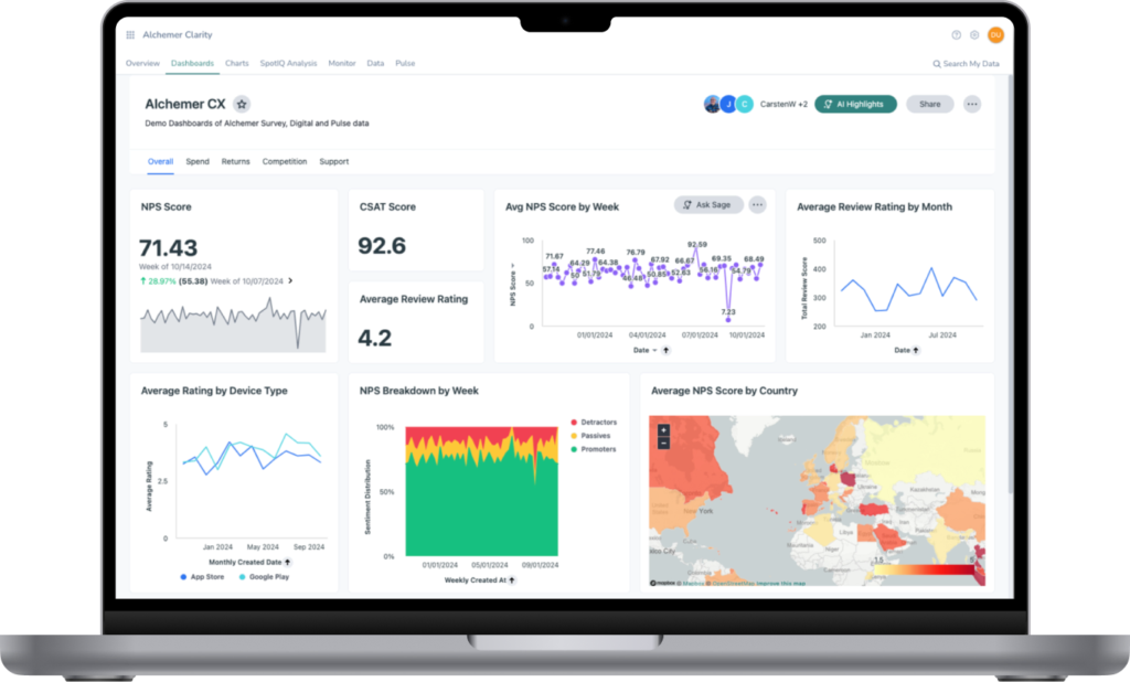
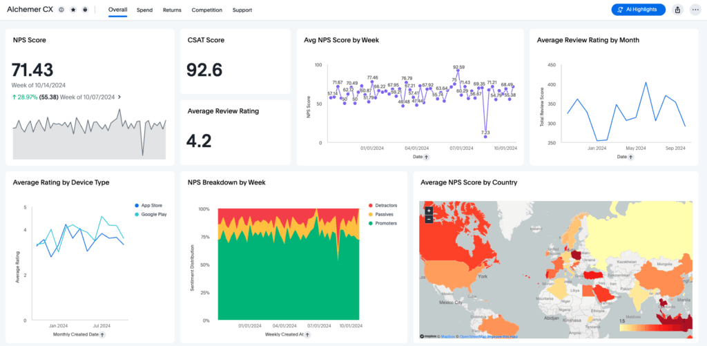
Match each business question with a chart or visualization.
Examples:
→ “NPS over time” = Line chart
→ “Top support issues” = Bar chart
→ “Customer churn by region” = Map view
→ “Theme clusters from open-text” = Word cloud or AI-powered verbatim analysis -
Use consistent naming conventions.
Examples:
→ Use: NPS_Q3_2025 or Customer_Segment_Tier
→ Avoid: Q5 or SegTypeA -
Normalize your scales and categories.
Example:
If one survey uses a 1–5 CSAT and another uses 0–10, normalize both before visualizing. -
Segment data meaningfully.
Examples:
→ Plan tier
→ Support channel
→ Product line
→ Geographic region -
Group visualizations by role or decision type.
Executive view: Macro KPIs, AI anomalies
CX team view: Case types, time to resolution
Product view: Feedback by feature or platform -
Establish source-of-truth systems.
Define which system “owns” which metric (e.g., CRM for account data, Alchemer for NPS). This eliminates duplication and confusion when data overlaps.
Step 5: Build and Configure the Dashboard
Now it’s time to build. But resist the urge to drop in charts just because you can. Build with purpose and clarity.
Use storytelling techniques to guide users through insights. Lean on AI tools to surface trends and automate the heavy lifting. The end result? A dashboard that helps you act on feedback.
-
Make dashboards interactive and role-based.
Let managers drill down by team, region, or product. Let execs see the 30,000-foot view instantly. -
Enable real-time updates and automated refreshes.
No more “last quarter’s data in this quarter’s meeting.” -
Use Alchemer's Spark feature to ask your data questions directly.
Examples:
→ “Why did CSAT drop in Q2?”
→ “Show NPS by segment for premium accounts in Europe” -
Leverage Alchemer's AI Highlights feature to detect patterns.
Examples:
→ Spot an unexpected spike in churn? Let AI Highlights surface the underlying issue automatically.
→ Just ask or click, and Spark shows you a chart with a human-friendly explanation.
Advanced Dashboard: AI Purpose-built for Feedback
Step 6. Iterate, Learn and Improve
Dashboards are never “done.” As your organization, teams, and questions change, so should the tools you use to guide them. Make iteration part of the process. Monitor usage, gather feedback, and continuously improve so your dashboard remains relevant, valuable, and widely adopted.
-
Conduct quarterly reviews with stakeholders.
→ “Is this dashboard still helping us make better decisions?”
→ “What’s missing or no longer useful?” -
Collect internal user feedback regularly.
→ Add a quick survey link on the dashboard: “Was this helpful?” -
Expand data sources over time.
Move from survey-only to a unified feedback + operational view. -
Celebrate wins. Track actions taken based on insights.
Examples:
→ “We identified a spike in negative reviews after an update—Product fixed it in 3 days.”
Start Turning Feedback Into Results
If your goal is to act on feedback—rather than just collect it—Alchemer Dashboard is the tool that makes it happen. No more delayed reports or siloed data. Just continuous, connected insights that feed decisions, fuel growth, and deliver real-world impact.
Interested in seeing how Alchemer Dashboard can transform your feedback?
The Roadmap to a Great Dashboard!
This e-guide is just one part of a multi-guide series and story. Use the links below to checkout the other guides!
Step 2: Measure & Benchmark for Smarter Business Decisions
Step 3: Question and Explore: Find the “Why” Behind Your CX Metrics
Step 4: Make a Change: Turn CX Insights Into Real Improvements
Step 5: Using Dashboards to Drive Change